2025
Chazak
01/
1000s of voices channelled into one movement
Shifting cultural norms to put SEE in the spotlight
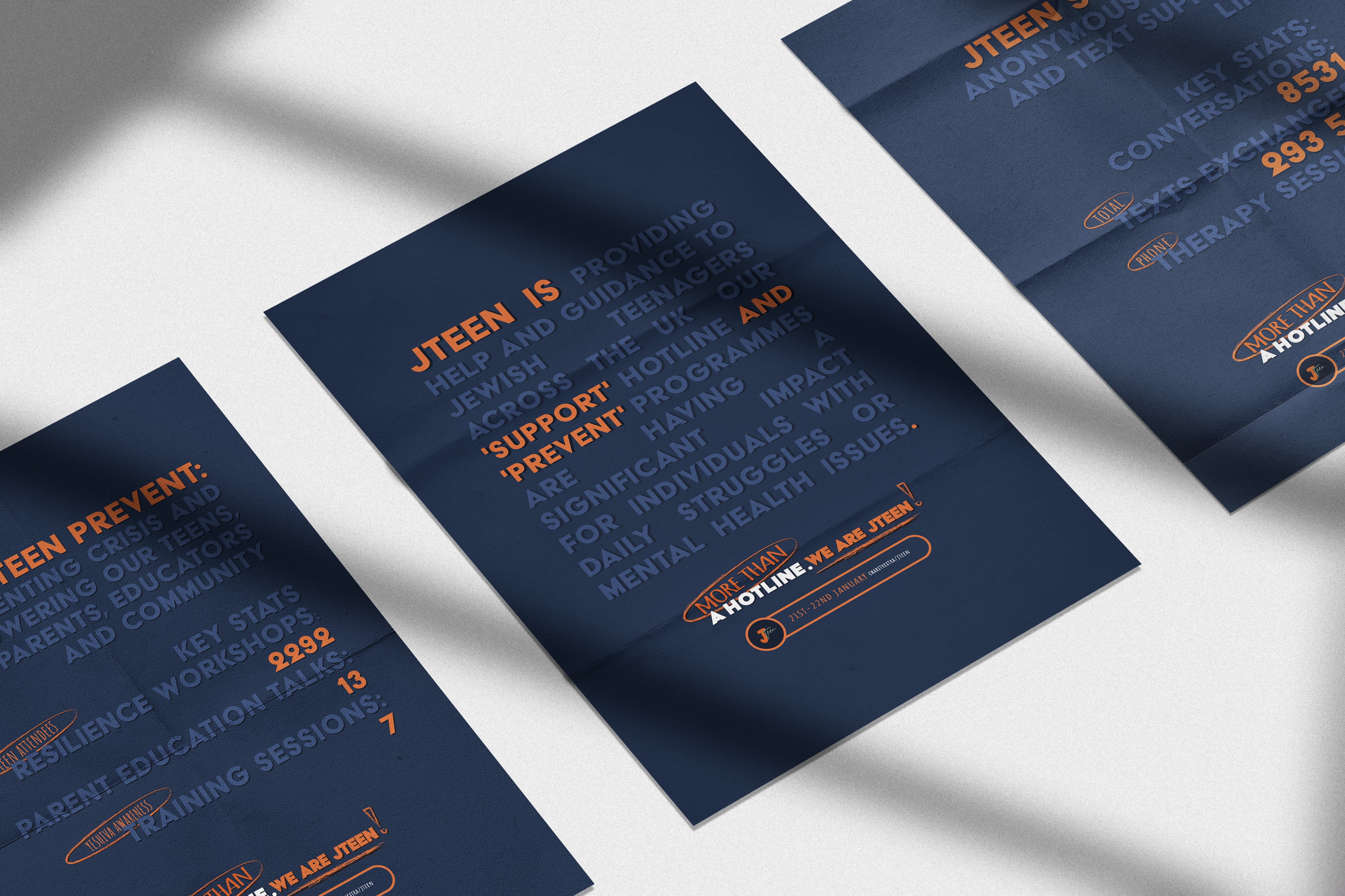
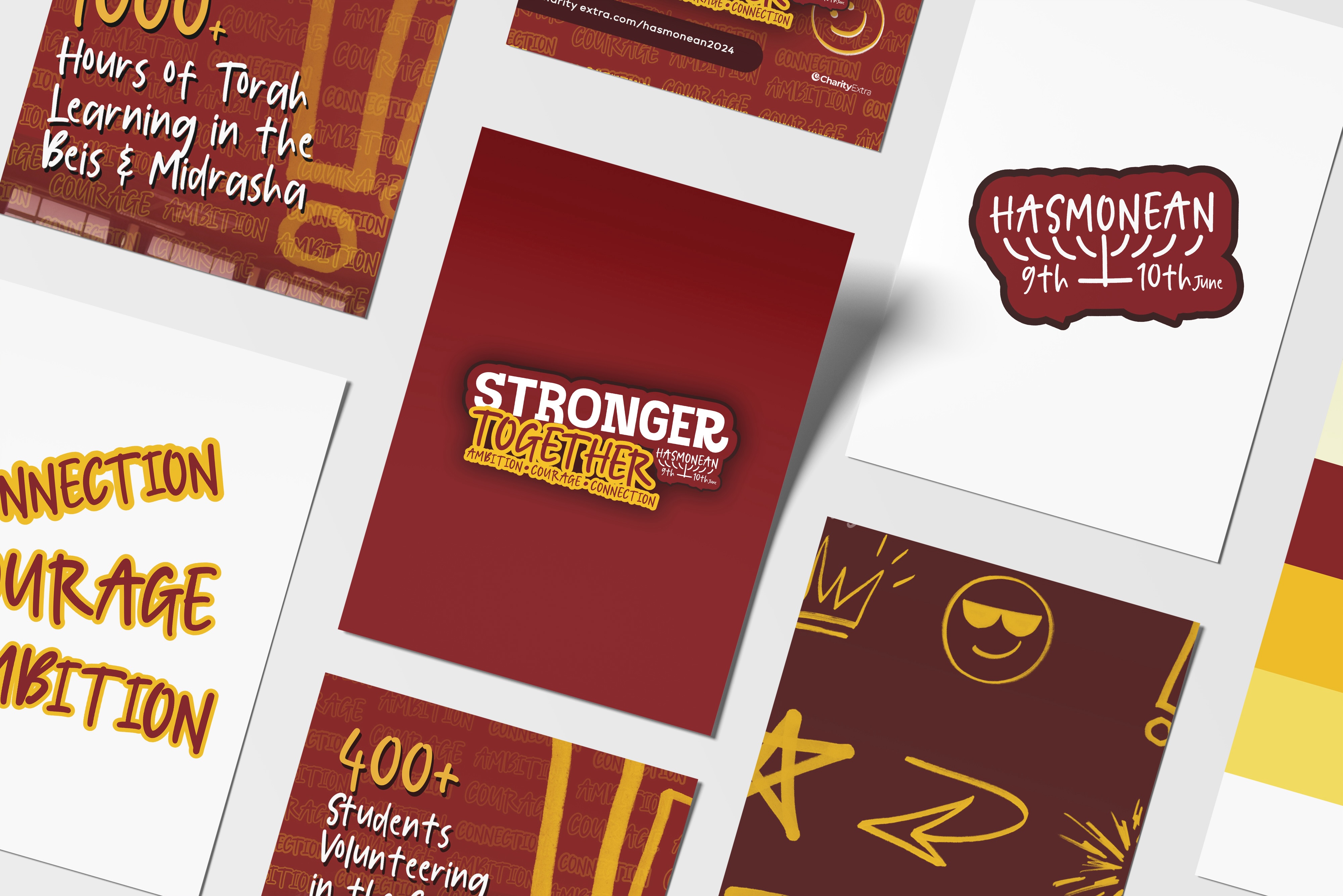
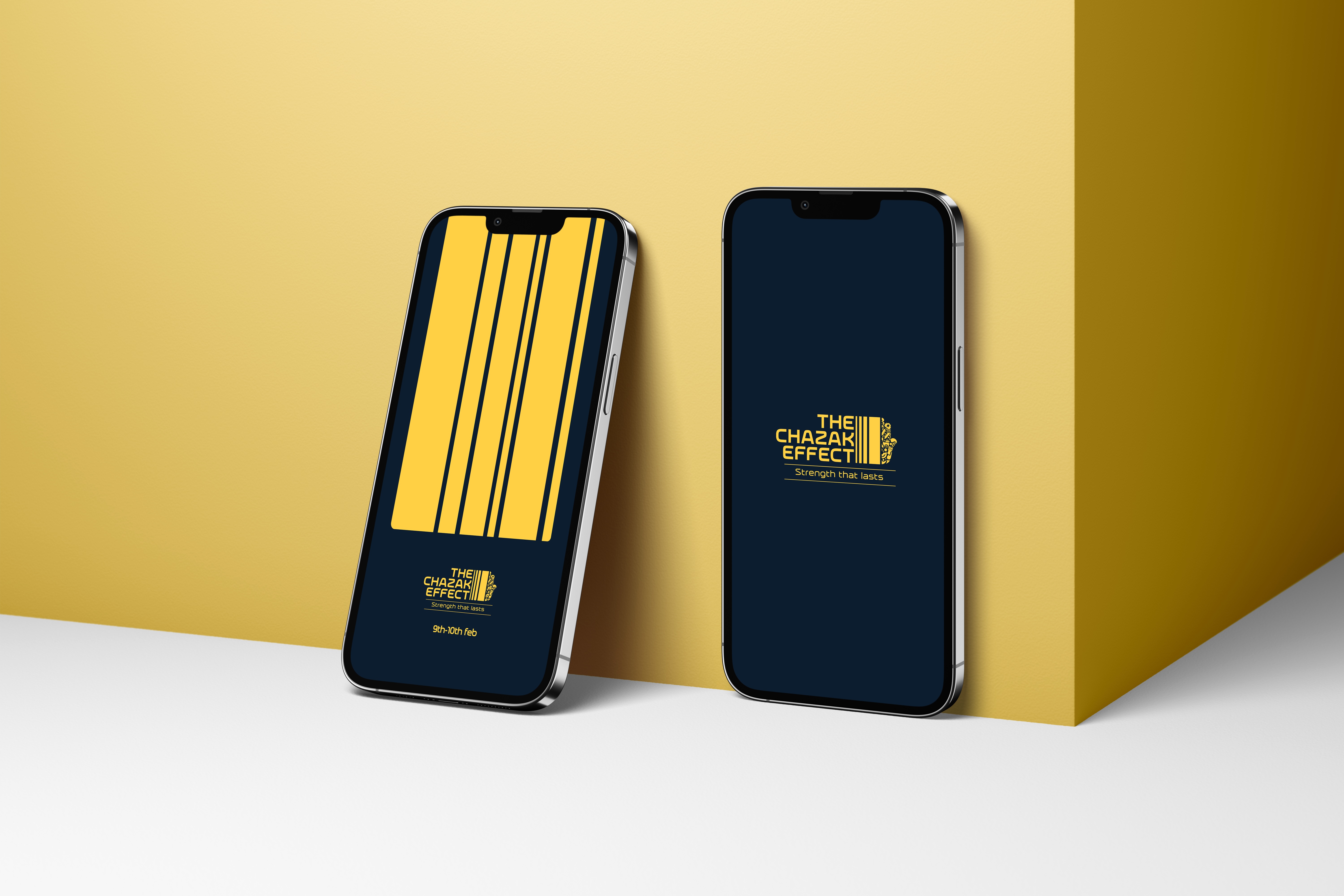
Chazak is a UK-based Jewish community organisation that inspires connection through heritage and empowers Jews of all backgrounds in a relatable and relevant manner. It offers programming that includes educational initiatives, youth engagement, and cultural events.
Chazak’s fragmented brand identity needed to be united through one strong, consistent visual impact.
02/
A visual identity steeped in heritage
thriving succes
A full spectrum rebrand rooted in cultural insight
Through collaborations with schools, synagogues, and other organisations, Chazak aims to inspire a celebration of Jewish culture, heritage, and continuity. We channelled this multifaceted and dynamic energy into a cohesive umbrella brand.
Chazak’s logo distills numerous echos of Jewish tradition in a united hamsa hand form. The tones, shapes, and fonts we chose for the charity’s branding emulate the richness of Jewish heritage and tradition.
03/
Using brand as an amplifier
Looking into the future
Increased brand clarity and alignment with Chazak’s values across initiatives enabled the charity to amplify its message and fundraising efforts across diverse communities.
We support Chazak’s brand development with an overarching ad campaign strategy, delivering several impactful ad creatives per month.