2025
Our Kids First
01/
Disrupting the legal space to hear the smallest voices
Shifting cultural norms to put SEE in the spotlight
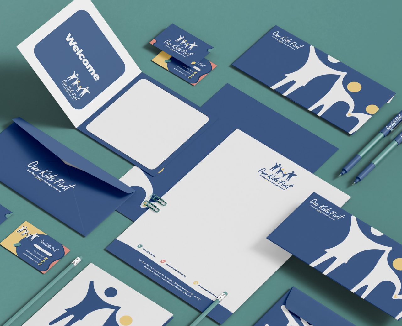
Our Kids First is a charity offering free, expert support to Jewish families navigating divorce. It is driven by volunteers and professionals committed to helping families rebuild and thrive post-divorce, creating healthier co-parenting dynamics and safeguarding children’s mental well-being.
Our task was to help Our Kids First stand out with branding and logo design in a legal-heavy space without losing its warmth.
02/
Establishing clarity in the chaos
thriving succes
A full spectrum rebrand rooted in cultural insight
We designed a logo that emphasises the importance of the family unit with the children at the centre, highlighted and connected with an accent of yellow. We chose a clean typeface and a calm, muted palette that reinforces the brand’s commitment to providing practical support while acknowledging the emotional challenges of separation.
Our approach to the charity’s visual identity kept children at the heart while standing out in the crowded ‘legal’ field by deviating from traditional style choices. This ultimately represented their mission to put families first and create amicable resolutions.
03/
Creating something you can trust
Looking into the future
The new brand speaks at once with empathy and strength, and resonates with both clients and supporters. The new visual identity has led Our Kids First to gain more visibility and recognition. It has fortified its position as a trusted resource for families in need, as seen in an increase in referrals and requests for support services.
“This was a difficult brief, as this is such a delicate subject. We wanted to really create a ‘warm’ feeling with every touchpoint, and that’s exactly what Infiniti created.” – J. Kay, OKF